Cantu
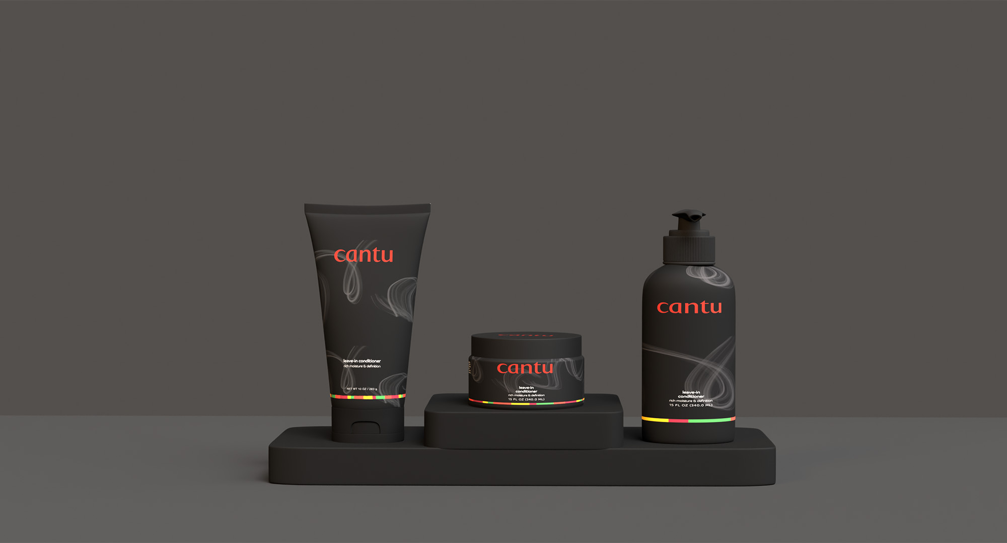
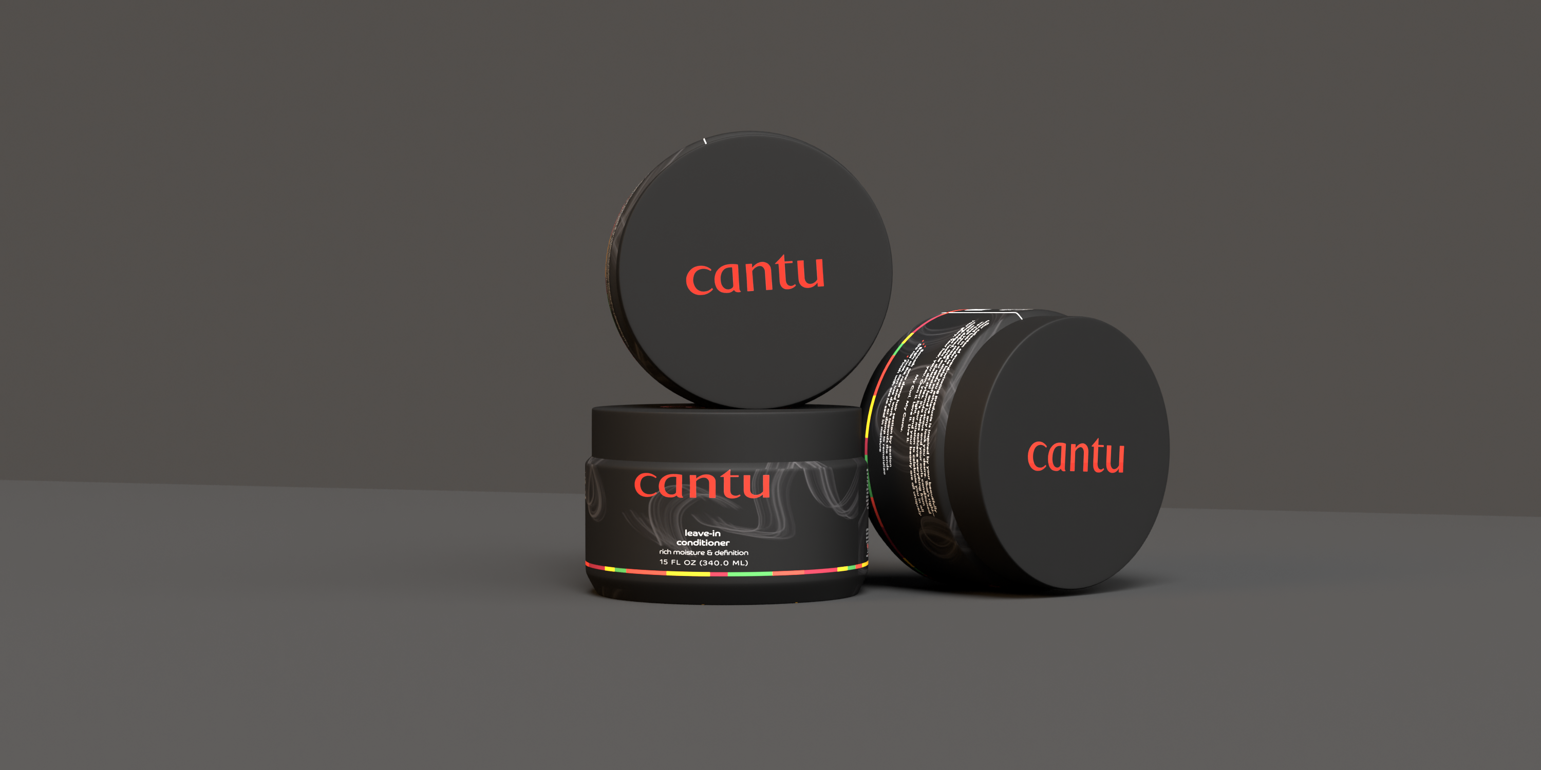
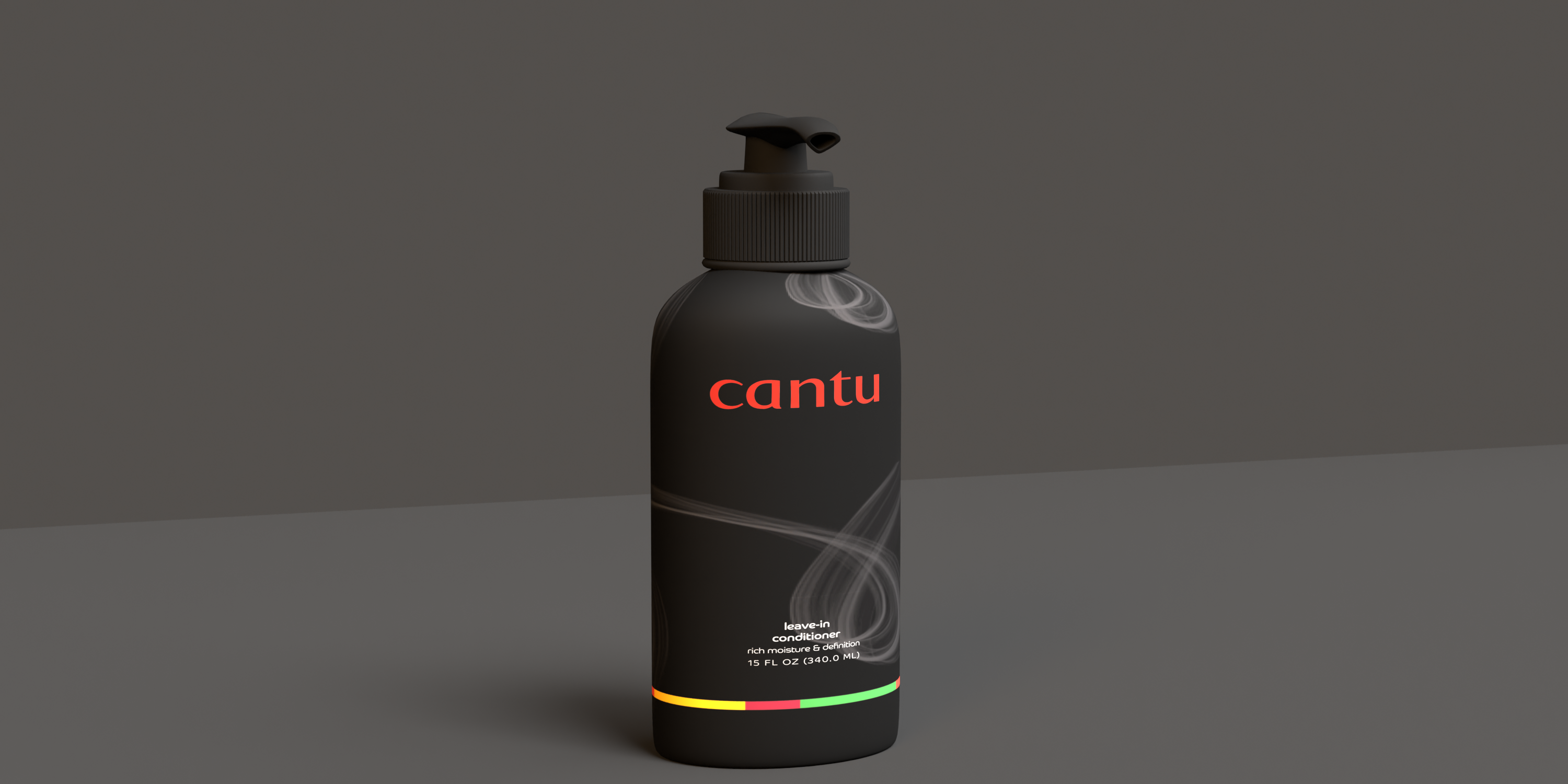
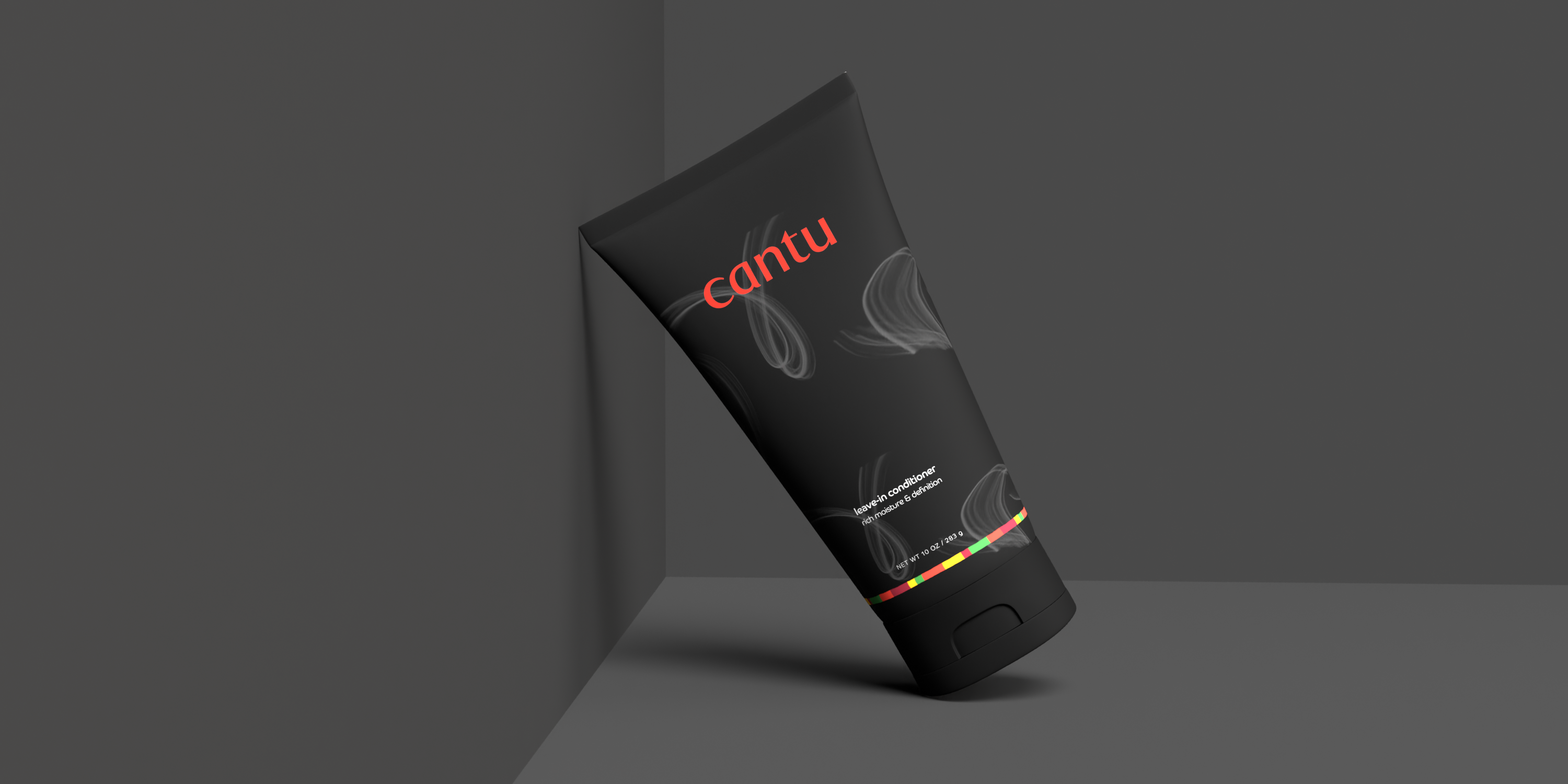
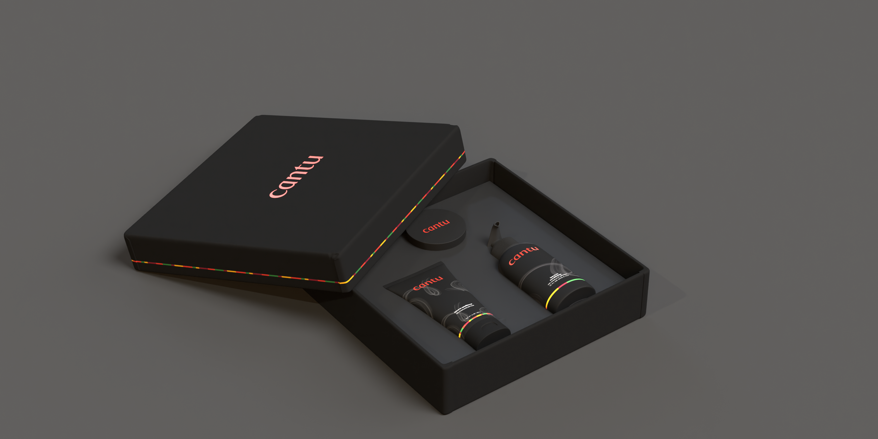
A redesign for the hair company CANTU. My goal was to create a more luxurious design that the original CANTU did not have. Keeping the three forms black and secondary colors minimal draws consumers in with the help of the gray, ‘smoke-like’ hair pattern in the background. CANTU often uses their signature orange, and I did not want to lose their identity. I decided to keep their signature stripe, however, it wraps the entire product instead of just the logo. I also decided that the only thing is that the logo remains orange as it’s more important to sit on a black background.
